Perfect in Word, wrong fonts and shifted lines in PDF. Many blame the converter—but Word records font names, not font files, and wraps are computed from character widths. Understand that chain and you know what's avoidable vs. when to change approach.
Why Does Word-to-PDF Layout Drift?
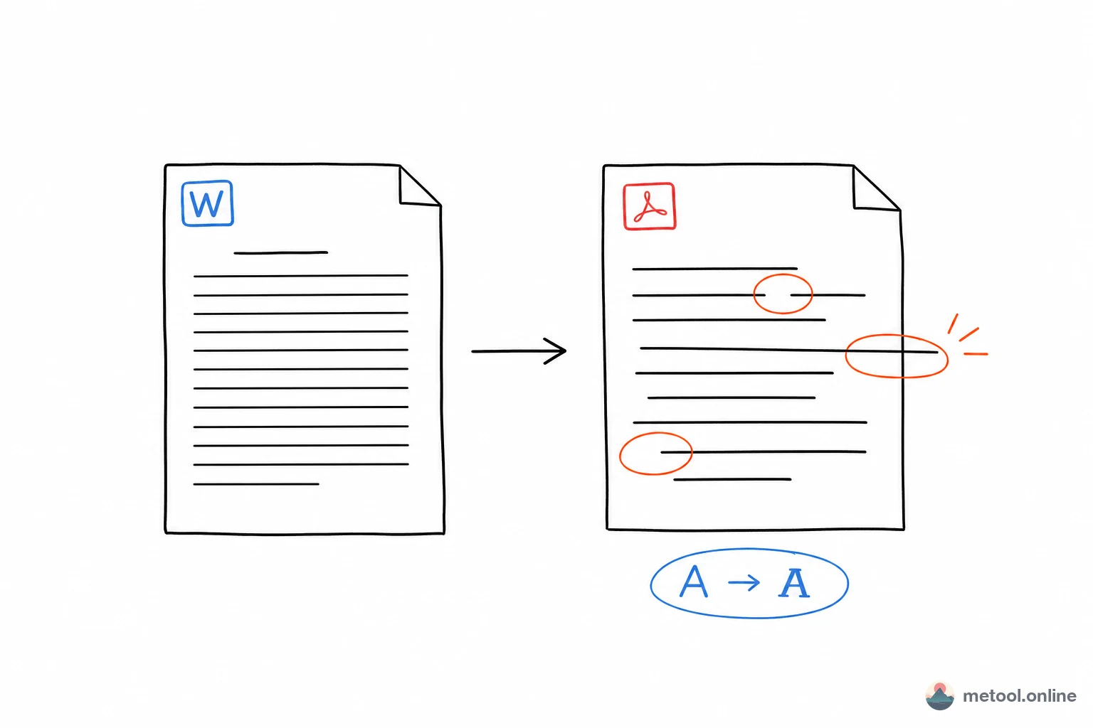
Core reason: Word doesn't bundle fonts by default—only names. Your .docx says "use Font X" but stores the name, not the file. Converter on another machine without that font picks a substitute—glyphs, weight, especially character width change.
Wrapping and pagination are width-driven: engine places characters until the line fills, then wraps. Substitute font → 30 chars become 28 → wrap moves → cascade through paragraph and page. "Layout broken" is usually font substitution chain reaction, not independent pagination bugs.
When Will It Almost Certainly Change?
Not every document breaks. Conclusion first: common fonts + simple layout → stable; obscure fonts + manual spaces → likely drift.
| Situation | PDF risk | Why |
|---|---|---|
| Body text: SimSun/YaHei/Arial etc. | Low | Converter likely has same names |
| Commercial/obscure font, not embedded | High | Substitution |
| Many manual spaces/tabs for alignment | High | Width change breaks alignment |
| Text boxes, WordArt, complex columns | Medium-high | Engine differences |
| Plain text, styles, tables | Low | Structured layout more stable |
Structured layout (styles, tables, paragraph align) beats spaces and special fonts for stability.
How to Maximize Fidelity?
Reduce uncertainty at source for Word to PDF:
- Prefer system fonts: Chinese—SimSun, Heiti, Microsoft YaHei; Western—Arial, Times New Roman—widely available, low substitution risk.
- Embed fonts: Word Save/Options → embed fonts in file—font travels with document. Some commercial fonts forbid embedding.
- Avoid fragile layout: paragraph align, tables, tab stops over space runs; text boxes, floating images, WordArt drift most across engines.
Word and PDF engines differ—complex docs may still have minor gaps; inherent to format conversion, not one tool's fault.
Still Misaligned? Lock Layout as Images
If the goal is "recipient must see exactly what I see" (poster layout, special fonts, signature blocks)—don't fight substitution; render each page as an image.
Word to long image → JPG/PNG locks layout: fonts, spacing, alignment frozen as pixels—no re-flow from missing fonts. Cost: no text selection, larger size—fits view-only fidelity, not edit/copy.
Advanced: Avoid Font Uncertainty at Source
If you author the doc and want cross-device consistency, consider Markdown + Markdown to PDF. Content and style separate—you write structure, fixed stylesheet renders export—less dependent on local fancy fonts. Good for tech docs, notes, manuals; formal templates with exact corporate layout still favor Word.
Summary
Word-to-PDF drift: names not fonts → substitution → width-based wraps cascade. Mitigate with system fonts, embed fonts, avoid spaces/text boxes for layout. Absolute fidelity: Word to long image freezes pixels; avoid fonts at source: Markdown to PDF. All conversion runs locally in browser—documents not uploaded.